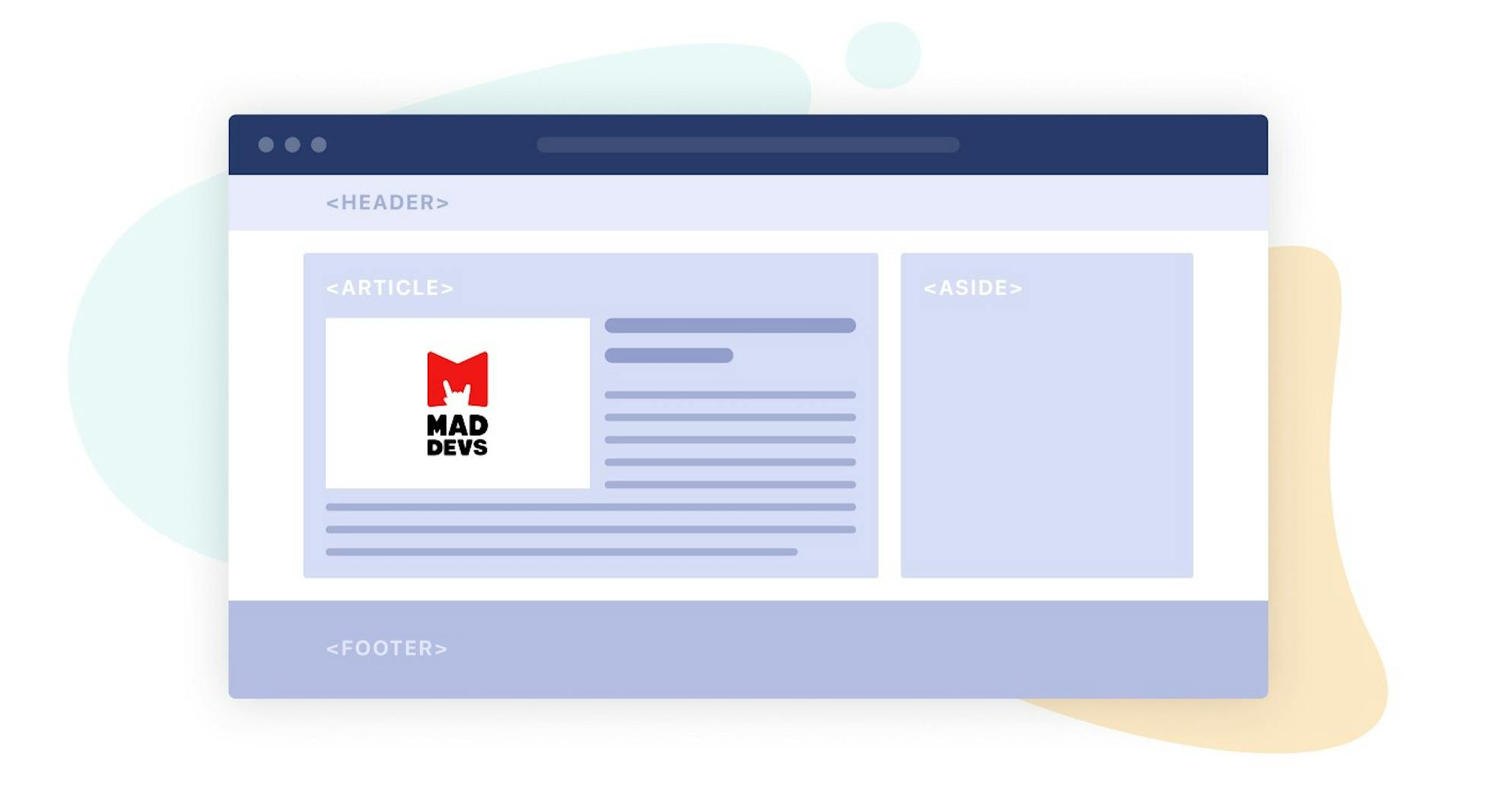
There is a myth that the easiest thing about web development is building a web page layout. Based on this, some developers decide not to waste time on learning a competent approach to layout. And it's in vain. There are many ambiguous moments in the layout, which are worth paying attention to.
In this article, you will learn how good layout affects the quality of web applications, their promotion in search queries, and conversion. We will consider the following topical issues: semantic layout, accessibility, images on the web, and so on.
Let's start with a partial list of how a valid and semantic layout can improve any project:
- Users make their first impression by the appearance of a website — the design and layout. If a page has a bad layout or is loaded too slowly, it is unlikely that this first impression will be positive. This is important because the first impression affects how long the users will stay on the page, whether they will perform targeted actions, and pay for the product.
- Website SEO. Which position pages will take in SERP affects many factors: semantics, accessibility, and optimization. A layout is a basis for improving SEO.
- It is important to optimize the speed of a page's loading. Users are less and less willing to wait for websites to load. And also, the speed of loading affects the ranking of pages in SERP.
As you can see, building a good layout is very important for the quality of the product. Let’s look at the best practices that will help make it better.
Semantic HTML
What is semantic HTML? Wikipedia provides a popular definition of semantic HTML:
Semantic HTMLis the use of HTML markup to reinforce the semantics, or meaning, of the information in webpages and web applications rather than merely to define its presentation or look.
But it is possible to give another definition that clearly explains why this approach is necessary.
Semantic HTML is a tool with which you can explain to search algorithms on how to analyze the content of the page. Special tags and techniques in semantic HTML show algorithms what the page about and how its parts are related to each other.
Based on this information, search queries for the website. This is what you need: dozens of specific tags instead of one universal.
In addition, the code is read not only by search robots but also by other developers. And the semantic code is easier to read.
A properly designed website will be better ranked by search robots and more likely to get on the first page of SERP. Learn how to use semantic HTML correctly to make your code simpler and clearer.
Search robots
Let's find out what search algorithms are that decide when and to whom to show pages.
When users enter a query into a search box, the following happens:
- Analysis and interpretation of words in the query. At this stage, the latest research in the field of natural language understanding is applied, from correcting spelling errors to determining the correct meaning of a word.
- After interpreting the query, suitable pages from the index are selected and ranked based on keywords and headings. The index is a repository of scanned pages. It contains information about the location and content of a page. When scanning and indexing a page, many factors are taken into account: the content of meta tags, website navigation, accessibility, page loading speed, the relevance of content, and page optimization for mobile devices. If a page does not meet the recommendations for webmasters, it may not be included in the search index and therefore will not be shown to users in the SERP. Read more about scanning, indexing, and ranking pages in Google Search Center.
- The most relevant results are then shown to the user. Various information is also taken into account when selecting pages: location, country, interests, and user search history.
So, in order to increase the position of your pages in the ranking of results, it is important to think about user-friendliness, the relevance of the content, and following the recommendations for creating web pages. Semantic HTML solves many problems, including helping algorithms to find the right pool of requests for the site.
POSH (Plain Old Semantic HTML)
The principle sounds like this: use HTML elements for their intended purpose.
Many new semantic tags have been added to HTML5. Before using div, think about which HTML tag you can use to explain to the search engine how to interpret this element. But it is important to understand what specific tags are used for.
For example, you are likely to be familiar with the aside tag. It is presented as a special tag for a sidebar layout. But there's been some confusion — the tag is needed (according to the HTML documentation) primarily to place content that is not related to the main topic of the page. Thus, search algorithms understand that there is no need to take into account this content when indexing the page. This tag is suitable for advertising. But to place their important and related to the main content will be a big mistake.
Also, for someone, the discovery that such tags as header and footer may not be on the page in a single copy. And footer does not have to be the last element in the section.
So, it is important to use HTML tags for their intended purpose. They are a convenient tool for manipulating the attention of search algorithms. But it is important to study and understand which tags to use in which case.
Headings
Headings are one of the most important things that search algorithms rely on when indexing a page. They make robots understand what your page is about.
Even if you are new to web development, you have probably heard the rule "You can't use more than one h1 tag per page." But if we look at the HTML documentation, we'll know that this is not quite true. There can be as many h1 tags on a page as you want. It is important to follow one rule: "one header per section." You can also use the headings of other levels to point to more specific content. According to the documentation, these two options are identical in terms of semantics. It is important to understand that the title of level 2 will be considered more specific than the title of level 1. The title of the 3rd level is more specific than the title of the 2nd level, and so on.
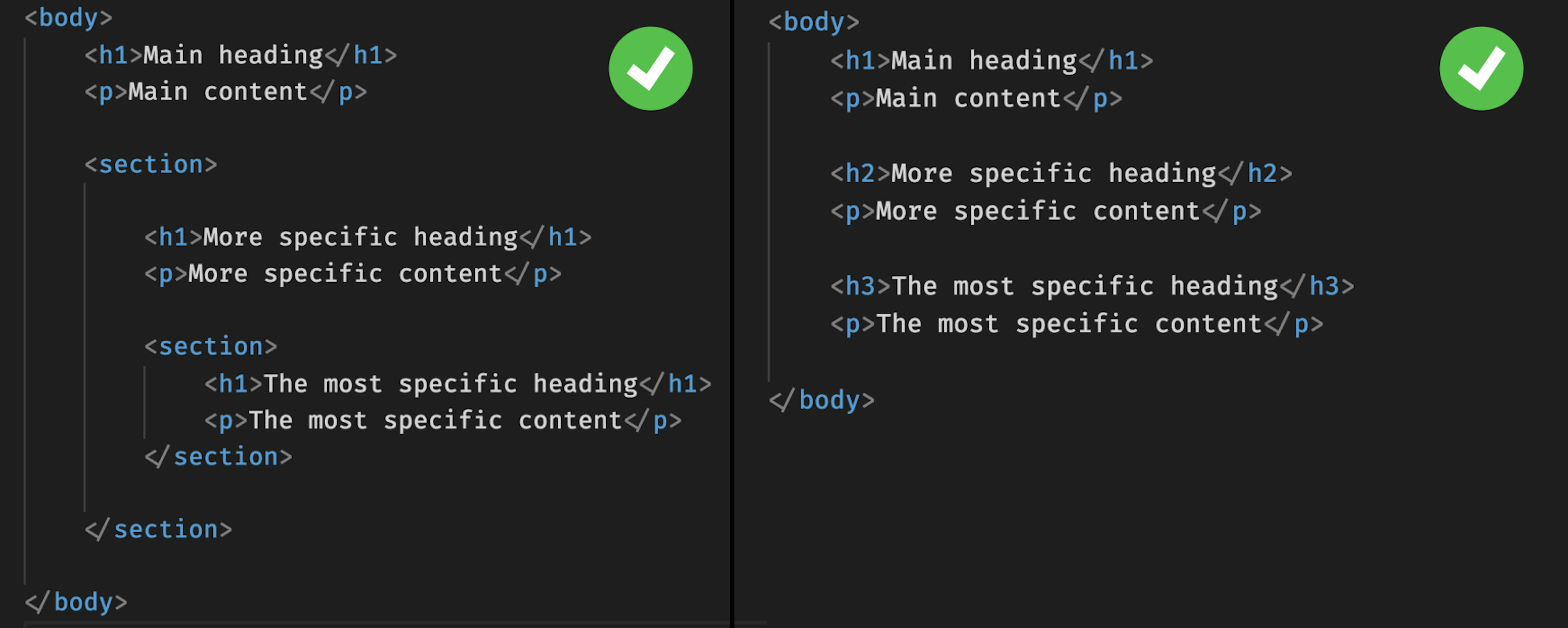
Headings in Semantic HTML
Links and buttons are important interactive elements of an interface. But the question often arises: when to use links (), and when to use buttons (
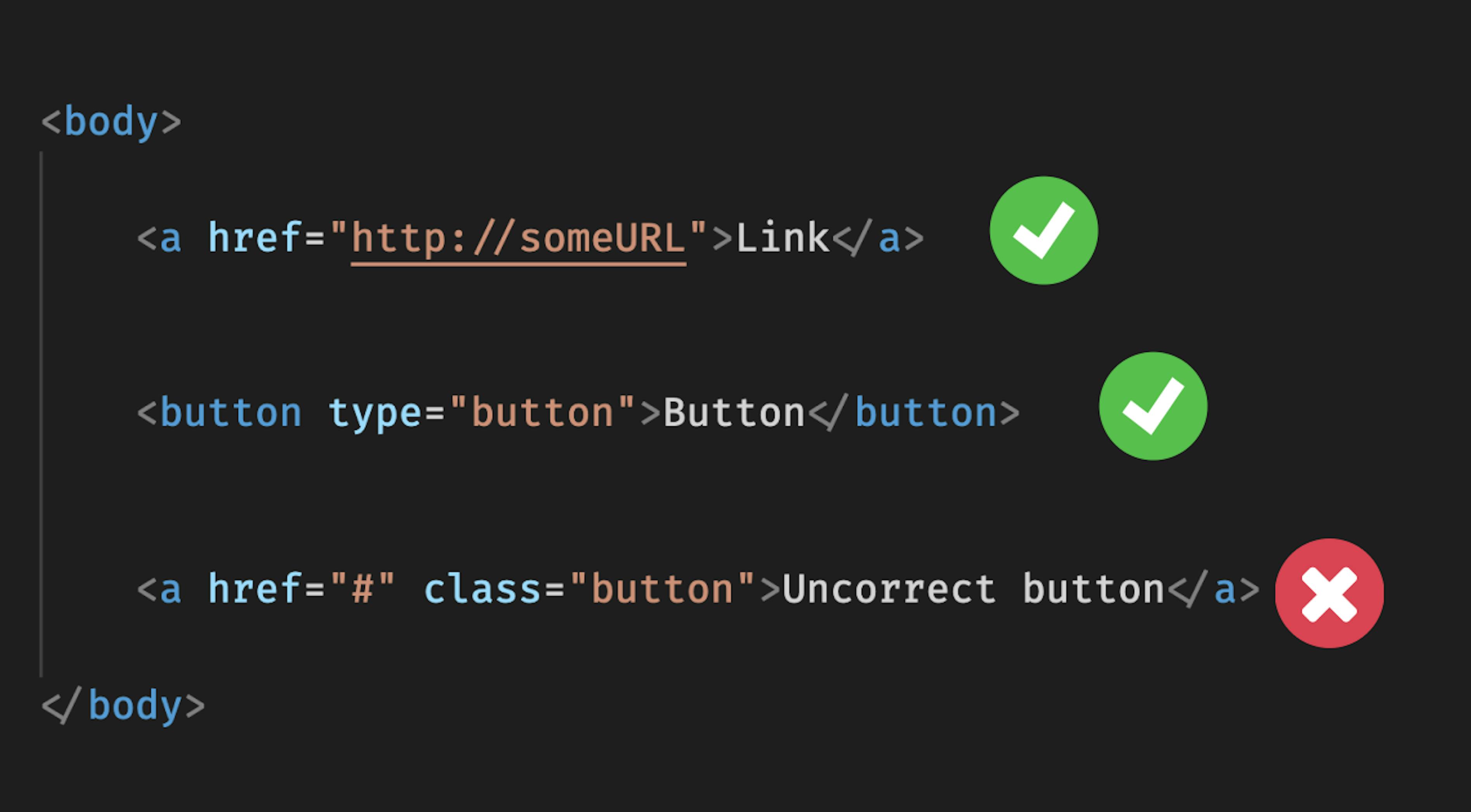
Links and Buttons
Accessibility
When developing a web application, you should take into account that some users have limitations such as visual impairments, low-speed internet, lack of a mouse, and so on.
Accessibility is taking care of the comfort of the maximum number of users. It is nice to use an application where you can see that the developer has thought about users.
As mentioned earlier, the accessibility of the site is important when scanning and indexing pages. This means that compliance with the principles of accessibility will help raise the website to the top of the SERP.
Screen readers
There is special software to help visually impaired people interact with the interface — screen readers. Like search robots, it is easier for them to read structured and semantically correct code.
It is also important to have the alt attribute in images, label tags for form elements, and a valid layout in general. Check for page accessibility during development and run the page through a screen reader (e.g., NVDA).
Alternative text for images
Always add alternative text for your images. The alt attribute is read by screen readers and is used for image optimization.
An important indicator of accessibility is the ability to interact with the interface using a single keyboard. Many people navigate through web pages without using the mouse. They should have access to basic interactive elements—links, buttons, forms, and navigation.
Check the navigation of your page with the tab key. Do not remove the outline property of important interactive elements from your page.
Accessibility with a low-speed internet connection
Accessibility principles also include taking care of users with low-speed internet. It is important to understand that not all users have fast internet. Check and optimize your page speed. While optimizing, you should pay attention to:
- Pictures. Select the correct format (see below), and use lazy loading for images. Learn more in the article on kinsta.com.
- Fonts. Use modern formats (WOFF2, WOFF), link rel="preload", and CSS "font-display" properties. Learn more in this article on dev.to.
- Optimize Critical Rendering Path. CRP is the minimum set of resources needed to start rendering a page (HTML, CSS, JS files). Optimization of CRP is usually achieved by delaying resources that are not needed for rendering. Learn more in this article on web.dev.
Accessibility for mobile devices
According to StatCounter statistics, more than half of the users use mobile devices to access the Internet. And only part of them has access to high-speed Internet. What is important for optimizing the page for mobile devices:
- Fast loading;
- Easy navigation;
- Ease of interaction with the interface.
Graphics
Work with images in the layout is a vast topic. The global problem with graphics layout — it weighs a lot. This affects the speed at which pages are loaded. Below is a list of the main recommendations aimed at solving this problem.
Image format
What image format should I use? JPEG, PNG, SVG? Here it is important to understand the differences in formats and use a suitable format for a particular situation. Graphics can be a bitmap (JPEG, PNG) and vector (SVG). Raster graphics should be used for photos. It supports the ability to create more complex images with a large number of colors and transitions. From minuses — it is not scaled without losses and weighs more. For other cases (icons, logos, simple illustrations) vector graphics are suitable. It is scalable and has a relatively small size.
WebP
WebP — graphics format from Google, created as a replacement for JPEG and PNG. It has a smaller size with the same quality. Supports lossy and lossless compression, transparency, and animation. Minuses: is not supported by all browsers. But this problem can be solved by applying the following point.
Adaptive images
You can use picture and source tags to make images adaptive. This allows you to use different images depending on the conditions. For example, you can upload two different images for different screen resolutions. Or you can upload two images that are the same. One — in WebP format, another — in PNG, for those browsers that do not support WebP.

How to use "picture" and "source" tags
Lazy loading
Lazy uploading of images allows you not to upload images until the user needs them. Previously, third-party libraries were used to implement lazy loading. Chrome 76 has an attribute "loading=lazy" for images as well as for iframe. Although it is not yet supported by all browsers, it performs its work perfectly.
The "img" tag and the "background-image" property
Use the img tag only for illustrations, semantic images. For presentation materials (background, icons) it is better to use background-image CSS property. By doing this, you get rid of one HTML element (which is good) and improve accessibility.
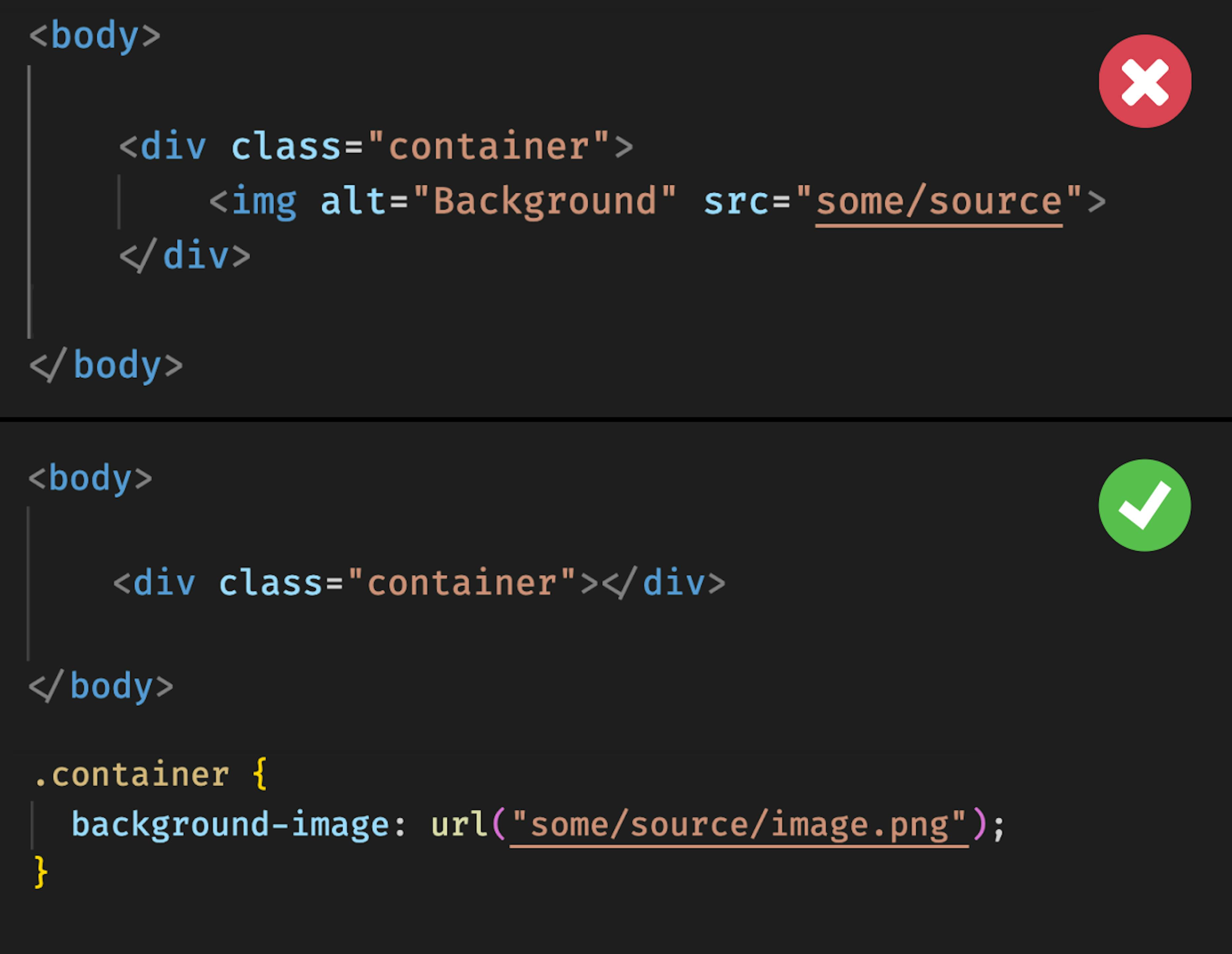
<img> vs background-image
Working with a browser
Responsive mode
The responsive mode in the DevTool is a development tool that allows you to understand how a page will look like on different devices. Unfortunately, it may not show platform-specific bugs. So always check the layout on real devices at the final stages of development.

Responsive Mode in Safari
Page audit
Special attention is paid to the Lighthouse tab in Chrome. There you can get an audit of the page. Lighthouse will analyze the page and make a report where you can see the strengths and weaknesses of the website, detect problems, and solve them. The report is presented on such parameters as Performance, Availability, SEO, Best Practices, and Correct PWA usage.
Lighthouse will help you both in general orientation, how the page meets the standards of web development, and point out specific errors. More about Lighthouse metrics you can find here.
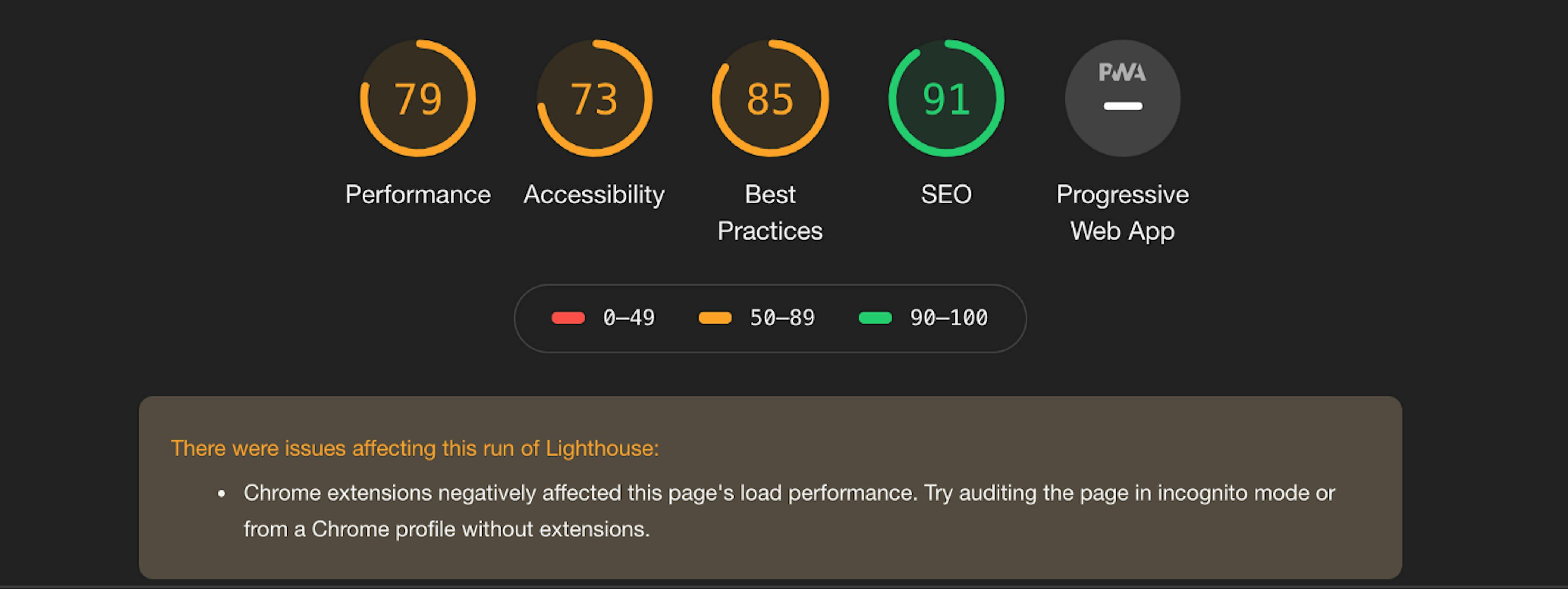
Page Auditing in Lighthouse
Browser support
New technologies are always good — everyone loves handy tools. But when using new technologies, you should remember to check the support of browsers. You can do this at caniuse.com.
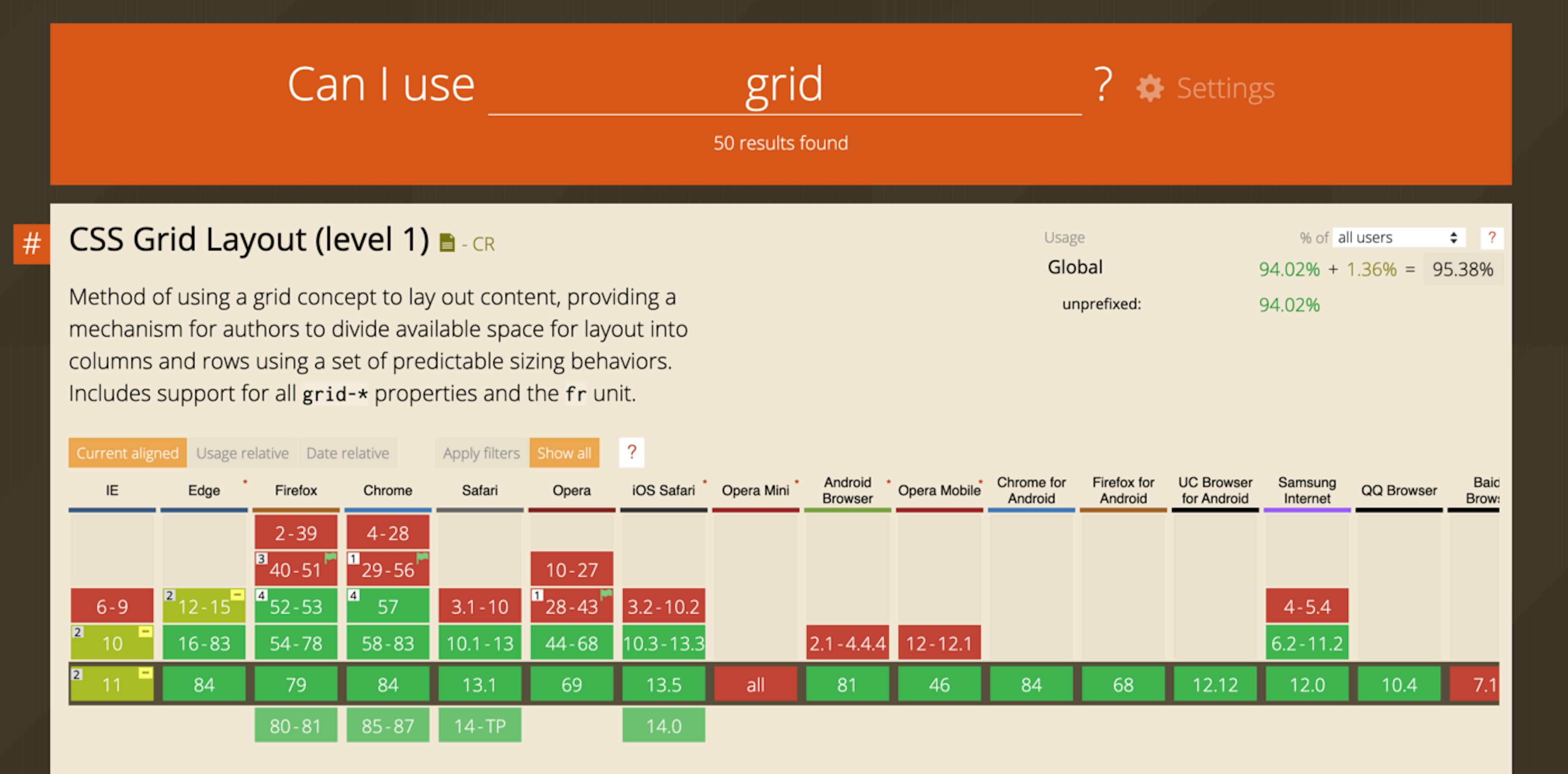
Can I use a grid?
Conclusions
Of course, this is not a complete list of practices to make the layout better. The world of web development is constantly changing. Tools and algorithms are changing too. But one thing's constant you should take care of the users.
With semantic HTML you will help users find the information they need. By applying accessibility principles you enable people with disabilities to use the product. By optimizing your pages, you take care of users who do not have access to a high-speed Internet connection.
When building a web application, it is important to remember that the products are made for people, not for horses.
Follow this rule and you will never do shit!

