Analyze with AI
Get AI-powered insights from this Mad Devs article:
Have you ever downloaded an app that was beautiful but impossible to use? Or encountered a website with broken buttons and confusing menus? These are prime examples of the importance of User Interface (UI) testing. In today's digital world, a user-friendly interface is no longer a luxury, it's a necessity for any successful product and an important part of software development.
In this article, we will examine what UI testing is, what to look for, and how it can be beneficial.
What is UI testing
UI testing is the process of verifying all visual elements and functionality of a user interface. Whether you are developing a website, a mobile application, or a desktop application, the goal of testing is to verify that the interface meets certain requirements and works properly.
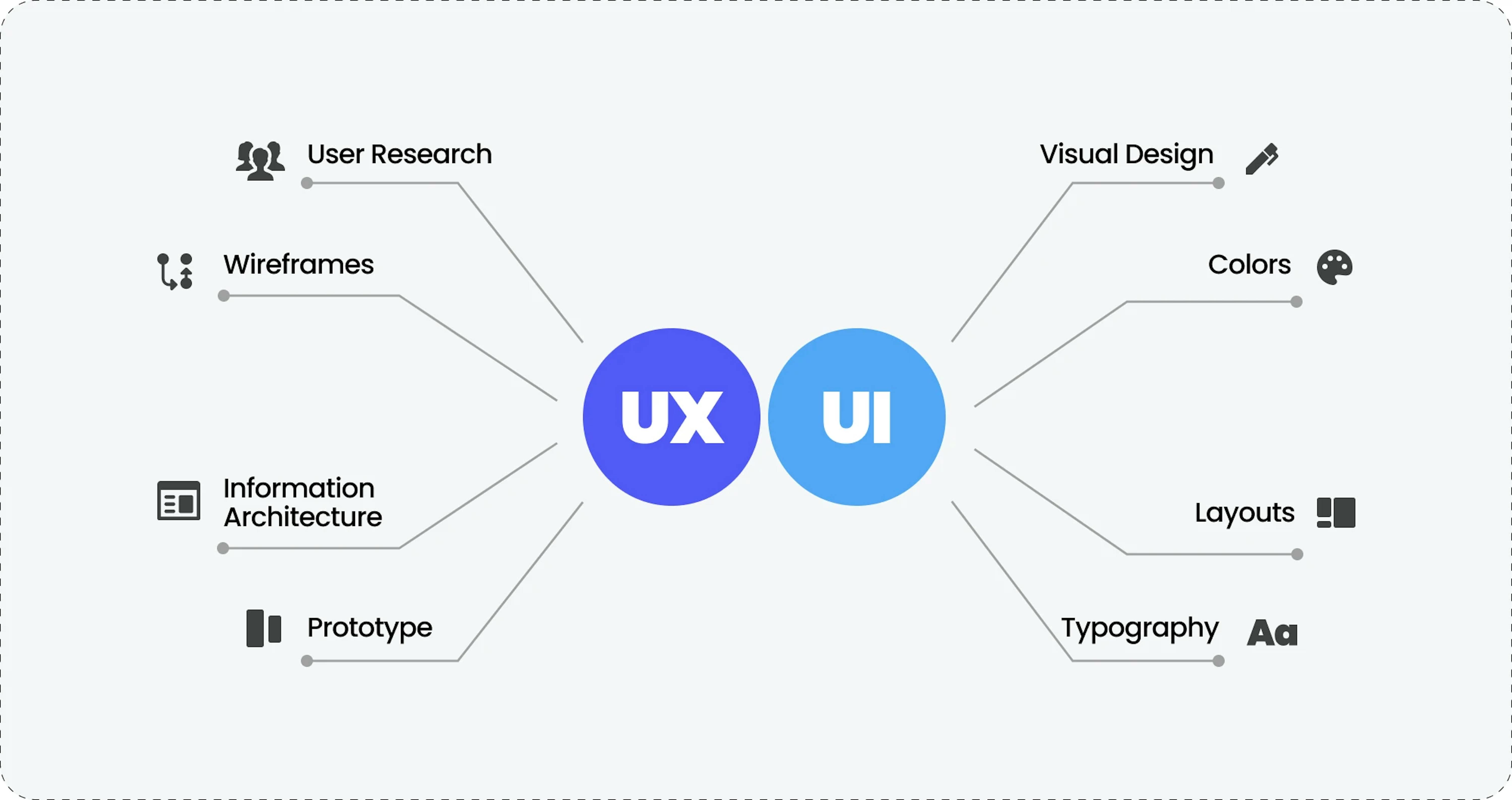
Difference between UI and UX testing
These terms are often confused, and although they are closely related, they are different concepts.

UI testing is related to the user interface:
- It focuses on verifying the correct operation of the user interface of a website or application.
- Checks the appearance compliance and interaction with the interface designers and developers provide.
- The main focus is on layout elements such as buttons, input fields, menus, etc.
- UI testing aims to ensure that the user interface functions without errors and meets the specified design parameters.
UX testing is related to the user experience:
- It focuses on testing the overall impression and user interaction with the application.
- Evaluates usability, efficiency, user satisfaction, and overall experience when working with your website or application.
- Investigates user behavior and response to various application features and usage scenarios.
- UX testing may include collecting user feedback, interviews, and observing their actions.
- Both aspects are important for ensuring a quality user experience and successful interaction with the application, and in practice, UI and UX testing often overlap and are interrelated.
What to test in UI
As the name suggests, UI testing covers various aspects of the interface: icons, menus, buttons, text fields, colors, fonts, and other controls.

Accordingly, when testing, you need to pay attention to the following:
- Design compliance — Does your app's visual language, including icons, color schemes, and typography, faithfully reflect the approved design? Consistency across all elements builds trust and reinforces brand identity.
- Navigation element check — Verify that the navigation buttons redirect users to the correct pages or screens.
- Progress indicator check — Are progress indicators clear and informative? Users shouldn't be left wondering if your app is frozen or working
- Input prompt check — Ensure entering text in fields automatically filters the values in the drop-down list.
- Interface adaptability check — Check how the interface elements are displayed on different screen resolutions and in different browser windows.
- Tooltip check — Do helpful tooltips appear when you hover over active interface elements if they were provided in the design? Clarity is key, so ensure these little helpers are present and functional.
- Keyboard shortcut check — Do keyboard shortcuts work flawlessly across different browsers, platforms, and devices? Cater to diverse user preferences and accessibility needs by ensuring keyboard compatibility.
- Adaptability — Does your interface look sharp and function perfectly on various screen sizes and resolutions? Embrace adaptability to create a universally positive experience.
Remember, UI testing is not just about checking boxes but crafting an interface that users love. By diligently scrutinizing these key aspects, you can ensure your digital products leave a lasting and positive impression on your audience.
Moreover, addressing potential issues early ensures a seamless development process and delivers a high-quality final product. Let’s check the proactive and comprehensive approach to design testing.
Steps for design testing
To eliminate questions and downtime during development, you can identify layout problems in advance and ask the designer to finalize them before the developers start implementing the design. When checking the layout, pay attention to the following points:
Adherence to requirements:
Verify that the layout meticulously aligns with the specified technical specifications.Unified design language:
Scrutinize the consistency of colors, fonts, message text, and other design elements to ensure a cohesive user experience.Precise element placement:
Confirm that all interface elements are meticulously aligned and adhere to the defined dimensions.Clear error communication:
Ensure error messages are strategically placed and effectively displayed, and that they possess the correct font, color, size, and position.High-quality visuals:
Guarantee that images display clearly, remain within page boundaries, and do not obscure other elements.Responsive across devices:
Verify that the interface flawlessly adapts to various screen resolutions and browser window sizes.Dynamic element states:
Ensure interface elements display accurately in different states, such as hover, click, active, and highlight.
By taking these steps, you can ensure that your final design is not only aesthetically pleasing but also functional and user-friendly, paving the way for a successful development process.
Compliance with guidelines
A guideline is a collection of rules, principles, and regulations. From it, internal and external designers learn what font size should be in a particular place, what color is allowed to draw the brand logo, and where it can and cannot be placed. Ideally, this is an exhaustive encyclopedia on working with corporate identity elements; however, it should be noted that such a document may not always be available.
Also, at the moment, there are two generally accepted guidelines for two well-known platforms:
Apple Human Interface Guidelines for iOS:
- Provides detailed instructions for designing user interfaces for Apple products, including iPhones, iPads, and Apple Watches.
- Covers a wide range of topics, such as typography, color, icons, and layout.
- It helps to create user interfaces that are consistent, intuitive, and visually appealing.
Google Material Design System for Android:
- Developed by Google, guides the designing of user interfaces for Android devices.
- Based on material design principles, which emphasize simplicity, boldness, and interactivity.
- It helps to create user interfaces that are modern, engaging, and easy to use.

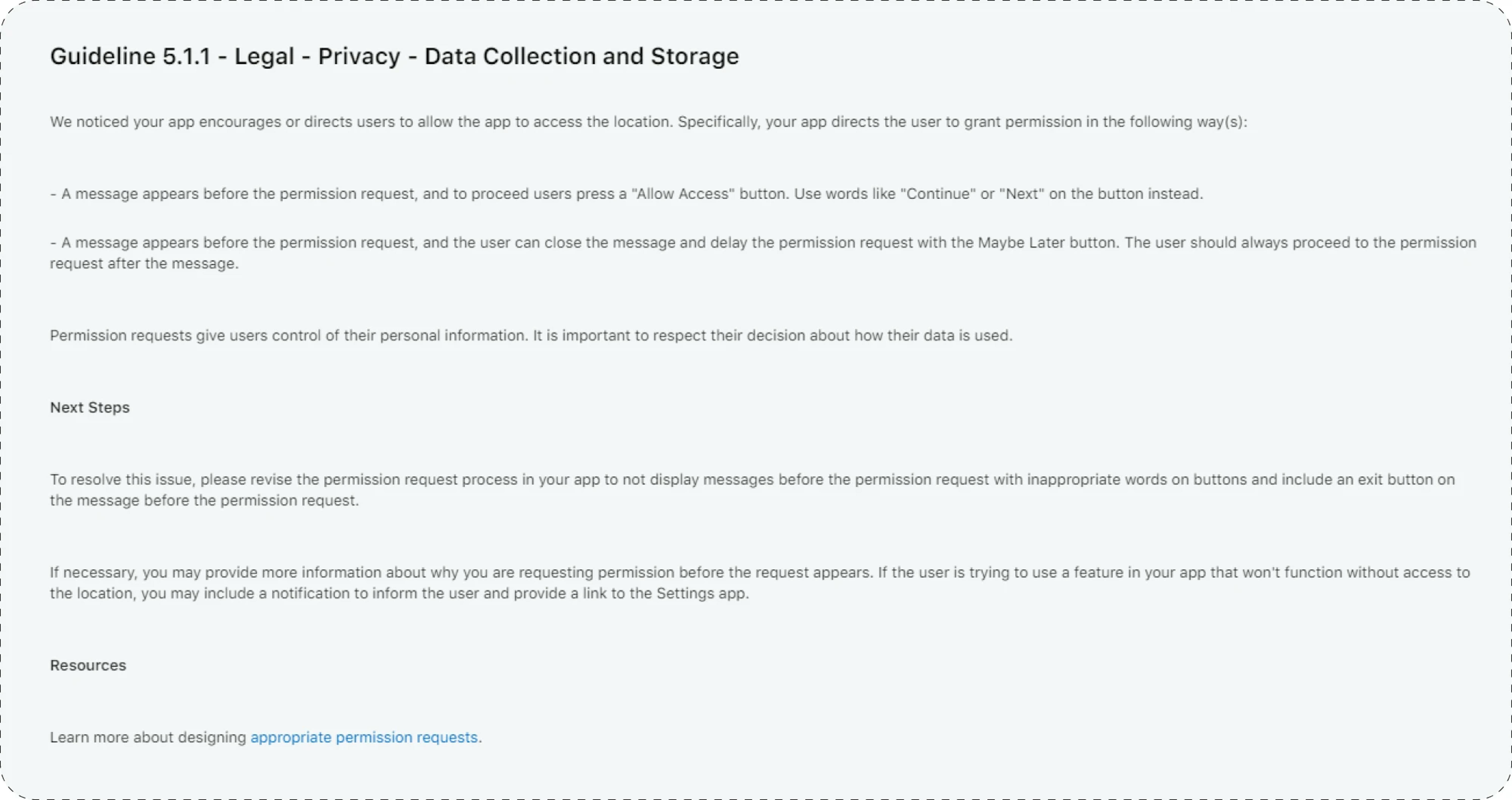
Ensure the interface complies with them and uses the recommended styles, fonts, colors, and controls. Because in some cases, if the iOS or Android guidelines are not followed, your application may be rejected for release in the AppStore or GooglePlay until they are fixed.
Web page design also has guidelines, such as WCAG, but they are mostly advisory in nature, and you can decide whether to follow them within your development team.
Important aspects of UI testing
When testing UI, you may encounter some challenges, such as:
Constantly changing user interface: Consider that applications are often updated and developed to meet new market requirements. This can make UI testing difficult, especially in web and mobile applications.
Increasing testing complexity: Modern applications have complex functionality, including frames, flowcharts, maps, and other complex controls. This makes UI testing a more complex and non-linear process.
Time spent on testing: Creating effective UI test scripts and executing the tests themselves can be time-consuming, especially if specialized tools are not used.
Maintaining test scripts: When developers make changes to the UI, test scripts need to be updated and maintained. This requires constant updating of the test case database.
Dark mode support: This modern option allows you to change the design of applications and all its elements to black. When this function is activated, the background will become dark, and all text will become white. Now, its support is implemented at the OS level, and many developers are adding this function to their own applications.
UI testing is crucial, but it doesn't have to be a tedious burden. By leveraging the right specialized tools and resources, you can streamline your process, boost efficiency, and ultimately elevate your product quality. Let’s explore useful examples on the market.
UI Testing Tools
By strategically incorporating these tools and resources, you can transform your UI testing process, ultimately delivering products that are not only functional but also delightful for every user. Feel free to choose the option that best suits your tone and purpose.
Figma

Figma is an online interface development and prototyping service with the possibility of real-time collaboration.
Probably the most relevant tool at the moment, as a tester, it allows you to check all layout properties: sizes, colors, fonts, and more without the need to install any application or extension, everything is available in the web version, right in the browser.
Adobe Photoshop

Adobe Photoshop is a multifunctional graphic editor that can be used to work with layouts provided in PSD format.
It is one of the oldest and most famous graphic editors. To work, you must install Adobe Photoshop to create the layout. The layout is saved and transferred as a .psd file, from which you can also extract all properties for comparison with the actual layout.
BrowserStack

BrowserStack is a cloud platform for testing websites and mobile applications on different browsers and devices.
An excellent tool for checking cross-platform compatibility or in cases when you need to check a specific case on a device, OS, or browser version that is not at hand.
PerfectPixel
![]()
PerfectPixel is a plugin that helps to check the compliance of websites created according to the principles of Pixel Perfect layout.
The principle of operation is very simple:
- A page layout in the form of an image is loaded into the installed browser extension.
- The image is superimposed on the finished page in a semi-transparent mode.
- The finished page should максимально совпадать с наложенным изображением (match the overlayed image as closely as possible).
- Any discrepancies should be corrected.
To wrap up
UI testing is an important part of digital product development. The goal of testing is to ensure a quality user experience, compliance with design, reliability, and usability of the application. To achieve this goal, it is necessary to test various aspects of the interface, check its compliance with guidelines, and consider the features of modern applications. Using specialized tools and resources will help simplify and increase the UI testing process's efficiency, thereby improving your product's quality.
Are you worried about interface bugs and frustrating user experiences? Mad Devs is here to help you unlock the full potential of UI testing. Contact us for a free consultation.


